
How To Create CSS Glitch Effect
Have you seen the emerging trend of a glitch effect creeping into some websites? Are you wondering how some of these effects were created?
By Petr Tichy on https://ihatetomatoes.net/how-to-create-css-glitch-effect/
Most of the effects on Kikk.be by Dogstudio and Year In Music by Stinkdigitalare using mix of canvas filters and rendering, but some of them are just a clever use of :before and :after pseudo elements.
In the past we have created CSS3 Button Hover Effect or CSS3 preloader and in this tutorial we will recreate a simple glitch hover effect using pure CSS.

Firstly we will create a simple a element with a class .glitch.
<a href="#" class="glitch">17</a>This could be anything, but I use my favorite number 17!
We will style it and center it on the page.
.glitch {
    font-size: 130px;
    line-height: 1;
    font-family: 'Poppins', sans-serif;
    font-weight: 700;
    position:absolute;
    top: 50%;
    left: 50%;
    transform: translate(-50%, -50%);
    margin: 0;
    text-decoration: none;
    color: #fff;
}
Then we will create two css pseudo elements :before and :after.
.glitch {
    /* previous code */
    &:before, &:after {
        display: block;
        content: '17';
        position: absolute;
        top: 0;
        left: 0;
        height: 100%;
        width: 100%;
        opacity: .8;
    } &:after {
        color: #f0f;
        z-index: -2;
    } &:before {
        color: #0ff;
        z-index: -1;
    }
}
The :before and :after elements are simple “duplicates” of what the main element contains. In our example this is content: '17'.
These two elements are positioned right behind the main element.
To create a very convincing glitch effects the colors of these elements are very bright saturated colors blue (#0ff) and purple (#f0f).

Now that all 3 elements are sitting on top of each other, we will create the CSS3 animation.
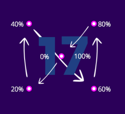
@keyframes glitch {
    0% {
        transform: translate(0)
    }
    20% {
        transform: translate(-5px, 5px)
    }
    40% {
        transform: translate(-5px, -5px)
    }
    60% {
        transform: translate(5px, 5px)
    }
    80% {
        transform: translate(5px, -5px)
    }
    to {
        transform: translate(0)
    }
}
Here we are creating 6 keyframes and moving the element using the transform: translate property.
It starts and ends at translate(0), which means that the elements will always end up at the original CSS position.
Now we will trigger the animation on hover.
.glitch {
    /* previous code */
    &:hover {
        &:before {
            animation: glitch .3s cubic-bezier(.25, .46, .45, .94) both infinite
        }
        &:after {
            animation: glitch .3s cubic-bezier(.25, .46, .45, .94) reverse both infinite
        }
    }
}We are using the shorthand to write our CSS3 animation on one line.
animation: glitch .3s cubic-bezier(.25, .46, .45, .94) both infinite
The shorthand takes 5 animation properties:
Check out this CSS Tricks animation article for more details.
Both pseudo elements will use the same animation (glitch), duration (.3s), easing (cubic-bezier), fill-mode (both), iteration-count (infinite).
To make the effect more random we are setting the animation-direction for the :after element to reverse.
This will make it go in the reversed direction than the :before element animation.
Want to see what it looks like when everything is worked out? Go check out this link.
Want a better view of how it actually works? Check out this slow-mo glitch effect
Now lets create multiple variations by changing the size, color and animation duration. Get a look at some examples here.
On the smaller elements you only need to move the pseudo elements by 1 or 2 pixels.
You can also play with the number of keyframes to achieve different results.
Remember there is no “perfect glitch”, it’s OK if it feels random.
The glitch effect can bring some very unique style to your site, but can be also very distracting if you overuse it. Glitch responsibly!
